Recreate the career opportunities page
UX/UI Design | Web Design | Career Page on Recruitment agency
XP3 Talent System is a company that uses a combination of unique online tools, talent acquisition, training and coaching to assist organizations in sourcing the right candidate to build an employee-centric, profitable company.
I am a product designer who works in a team of three. My role in this project is to contribute and work collaboratively with teammates and other stakeholders throughout the design process of the career pages.
The career page does not allow users to apply for positions directly on their website and no application form is built into the Career Page.
The Hyperlink of the job details page has been re-directing to another recruitment platform.
Sometimes it is hard to learn where the candidates found the job.
The aim of this project will focus on re-creating the user experience by browsing the website’s career page and allowing candidates to apply for job positions directly through XP3 Talent.
For research, the group decided to do a competitive analysis for the company to show them different styles of career pages, the sites I compared are Robert Half, Kelly, and Randstad.
Each of them have its strengths and weaknesses which listed below:
Strengths:
Weaknesses:
Another team member also compared with sites such as 80 Twenty and Mixpannel. 80 Twenty has a side filter for the job listing and Mixpanel has a Listing view on the career page.


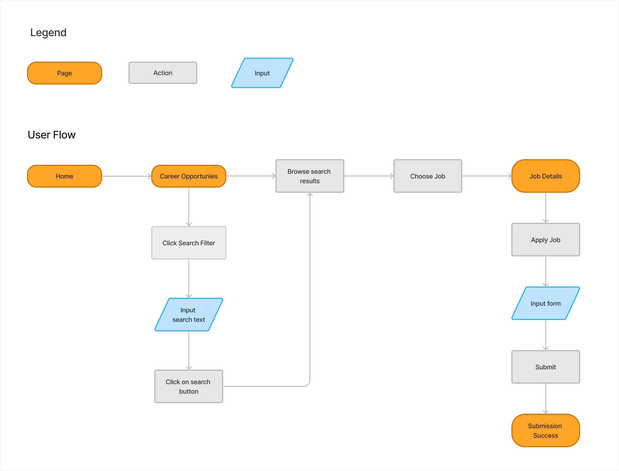
This time we have rebuilt the XP3 Talent Career page structure to simplify the navigation for users, reducing the number of clicks required. Which will only consist of one flow with 3 pages.

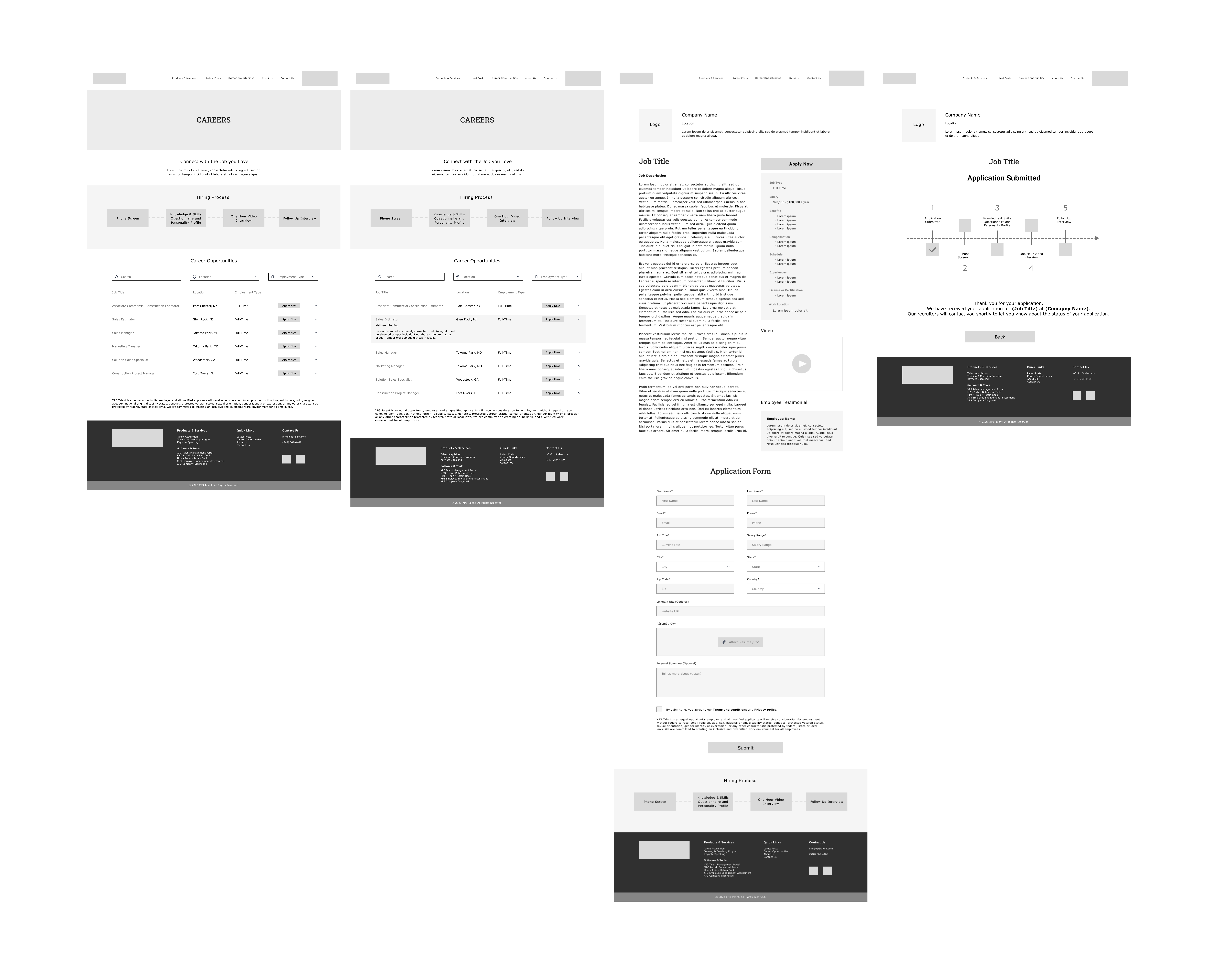
After completing the early research, we have each designed a set of wireframes by following the user requirements according to the business partners' requests, such as:

I have also demonstrated the searching flow, and the error screens for search results and application forms.

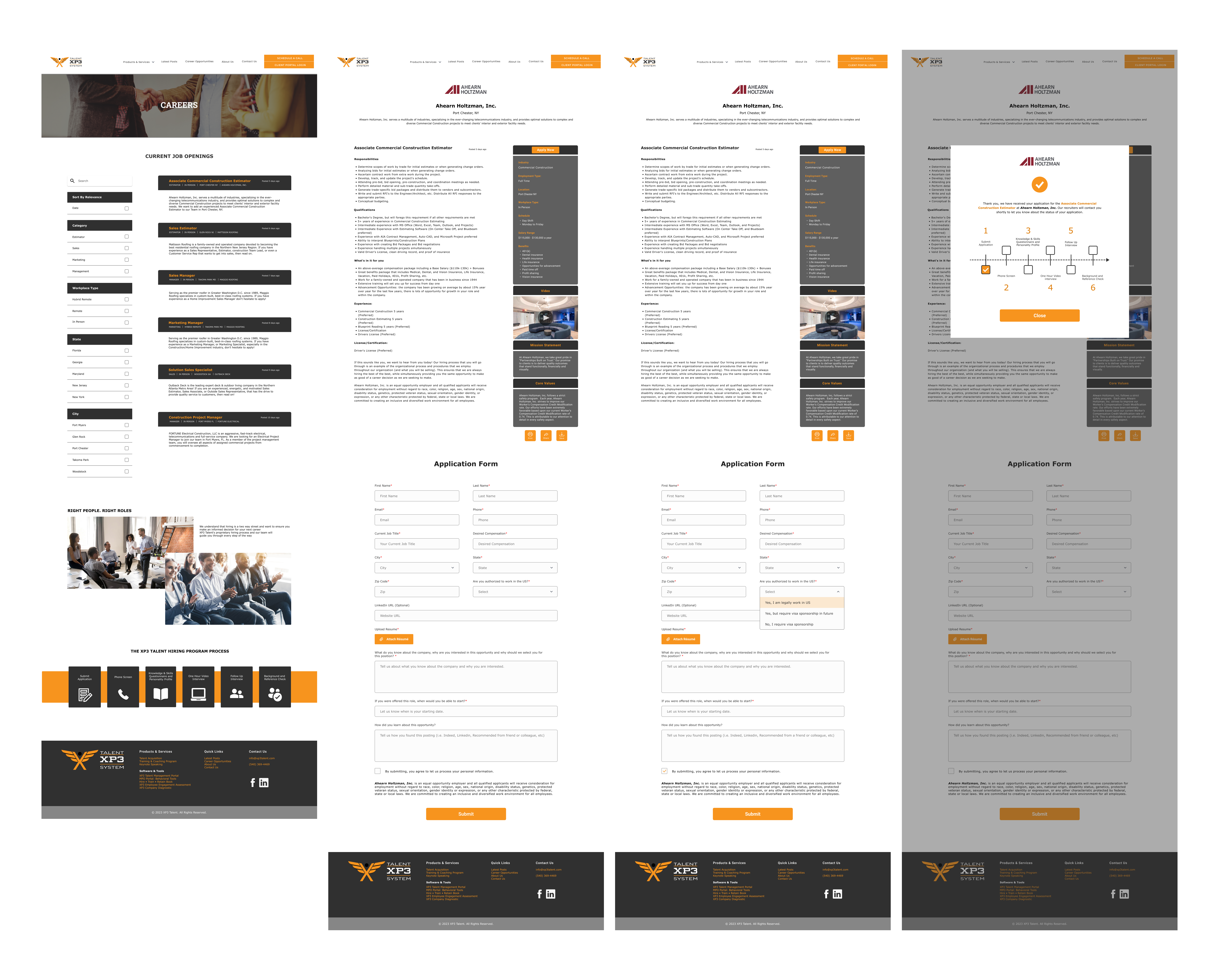
With each team member providing our wireframe designs, the business partner has decided to choose the job description page with application pages in use, with the success page in a pop-up version.
It took 2 iterations for the team to complete the final design. The Logo is now on the centre of the job details page. Other features include new fields in the form and the selections drop-down menu display on the High Fidelity screen. The Hiring Process has also been updated with more precise information.

With the final design, I believe the career page now is meeting the business goal and it has become more accessible for candidates to apply for jobs directly through XP3 Talent, while the company now can learn where the candidate heard the job listing from. Other suggestions on the career page would be that XP3 Talent can consider a horizontal search bar instead of a left vertical filter, so when candidates browse the website on other devices, it is more consistent when considering having a responsive design.
There are two key takeaways from my Industry Design Project:
XP3 Talent has its style guide, while its colours are orange and black, the orange colour does not pass the Color Contrast for WCAG Compliance in a white (#FFFFFF) background. However, the task we received was to create the career page instead of redefining the style guide. For our team to comply with the WCAG Compliances, we made some minor adjustments such as making the summary box on a grey background, so it can pass the Colour Contrast.
For the success screen, I preferred to have another page instead of a pop-up screen. But sometimes businesses have their own preference for what their website would look like in the final product. I believe it is our responsibility, the designer’s task to combine what the business wants and at the same time follow the design principles to create and improve the UX process as well as the UI of the products.